
People like to believe that they make decisions rationally. However, neuromarketing research shows that most decisions, including those about purchases, are driven by emotions and automatic brain reactions.
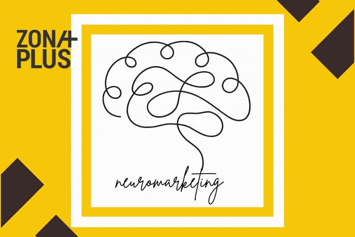
Neuromarketing is a combination of neuroscience and marketing.
It does not analyze what people say they want, but how the brain reacts to images, words, colors, sounds, or the arrangement of elements.
In digital marketing, this knowledge is extremely useful because almost every decision - click, sign up, purchase - is made based on what is seen on the screen.
Entrepreneurs and craftsmen who invest in a website or advertising can achieve better results if they know how the brain unconsciously reacts to content. It is not necessary to change the offer, it is enough to change the way it is presented.
Colors are not just for decoration. They communicate a message.
Likewise, colors directly affect emotions, create the first perception of a brand and often decide whether a person who finds themselves on your website will click somewhere, stay or leave.
When it comes to digital marketing, colors communicate faster than text. Our brain interprets them automatically, in a split second, and based on them assesses the tone, emotion and seriousness of the offer.
Here are a few examples of how different colors are usually perceived:
Changing the color of the CTA button, for example from blue to red, often brings visible changes in the number of clicks. In many cases, this small change, without changing the text or position, can influence the decision. Color can be enough to attract attention and encourage action.
It is also important to say this: there is no universal solution. The effect of colors depends on the type of product or service, the tone of communication and the habits of the audience. The combination of colors must be consistent and legible, with enough contrast and a clear hierarchy between the background, text and call to action.
If the colors are not carefully coordinated, the website can seem confusing, difficult to read or simply “not sit well” with the viewer. That's why color is much more than a design detail, but the way you create a first impression and a feeling that lasts.

Typography is an often overlooked design element, especially for smaller brands.
Font selection, while seemingly a technical decision, actually has a strong psychological impact.
People don't just read what's written on your website, flyer, or ad. They also subconsciously absorb how it looks.
Fonts, just like colors, communicate. They send messages about professionalism, tone of communication, and even how trustworthy or serious a brand is. If the typography doesn't "fit," the message won't make the right impression, regardless of the quality of the content.
When choosing a font, ask yourself: how do you want people to feel when they read what you're showing them? Because the font speaks too. You just have to know how to listen to it.
Sans-serif fonts
Fonts without endings ("serifs") look clean, simple and modern. They fit well in digital formats and are used by brands that want to give the impression of clarity, functionality and technological focus.
Serif fonts
Fonts with endings ("serifs") are associated with tradition, reliability and seriousness. They are ideal for brands that want to leave an impression of expertise and stability.
Decorative and “playful” fonts
These fonts can be visually interesting, but often sacrifice readability. They are suitable for specific design projects, posters or creative titles - but not for the main content of a website.
Fonts that are best avoided
There are fonts that are often used, but leave an unprofessional impression - either due to excessive use, poor readability or bad associations.
A study from MIT showed that people stay on a page longer when using a serif font, especially for content that requires concentration. This does not mean that serif is always better, but that you should choose carefully - depending on the type of content, the audience and the context.
A good font should not be distracting. It should “carry” the message quietly and confidently, without effort for the reader. A poor choice of font can create discomfort, seem frivolous or make the content difficult to follow.
Tip: do not use more than two fonts on the same page. Combine them meaningfully - one for headings, another for text - and always check how they look on mobile. The typography should work equally well on all devices.
UX (user experience) and UI (user interface) are often superficially reduced to a visual impression or beautiful design. In practice, especially when we consider neuromarketing, it is about something much more important.
Quality UX/UI design simplifies decisions, removes uncertainty and naturally guides visitors through content. Bad design confuses, slows down and increases the likelihood that a person will leave the site without taking action, even if they have come across a quality offer.
Good UX/UI design provides answers. It does not make a person think about what to do. It gently shows it - at the right time, in the right place.
Some of the most important UX/UI principles that rely on neuromarketing:
People do not read a website from beginning to end, but scan it. Most often in the form of the letter F (from left to right, then down) or Z (from top to right, then diagonally down). The most important information should be visible immediately, in logical places. If something is hidden or compacted, the brain simply skips it.
A button that calls for action (e.g. “Request a quote” or “Book an appointment”) must be clear, legible, contrasting and precisely formulated. Text like “Send” means nothing. But “Schedule a consultation” already gives direction and increases the likelihood that a person will click.
Not everything needs to be “filled”. Enough space between elements allows the content to “breathe”, and the brain processes information more easily. A website cluttered with content will not teach anything but make people give up. Minimalism is not emptiness, but a functional rest for the eyes.
Colors, typography, icon style, how titles are displayed - all of these should follow the same rhythm. The brain loves familiar patterns and predictability. When everything is consistent, a person feels safe. When it is not, trust drops.
Even with high-quality content, a slow page quickly loses the attention of those who open it. Every extra second of waiting increases the likelihood that someone will give up, especially if there is no sign that anything is loading or happening in the background.
Example: when you remove extraneous elements from a website, simplify the order button, and improve visual clarity, you often see an improvement in the number of actions taken. Without changing the offer or price, but simply through a clearer, more meaningful experience for the person viewing the content.

One of the most important things that neuromarketing emphasizes is that most decisions people make automatically, without deep thought.
Instead of analyzing the pros and cons, most people react to certain stimuli that the brain recognizes as familiar patterns of behavior. We call these stimuli psychological triggers.
In digital marketing, carefully placed triggers are useful for directing attention, instilling trust, or encouraging a specific action, without an aggressive sales approach.
Here are some of the most common examples used:
People have a natural need to see what others have done before taking action themselves. Noticing that others have already tried a certain service, given a rating or left a review, gives them a sense of security. This is why testimonials from satisfied customers, download counts or logos of well-known partners are often displayed.
When a limited-time offer or limited-quantity availability is clearly highlighted, many people feel a sense of urgency. Decisions are then made more quickly, for fear of missing out. This approach is often used with appointment bookings, promotional prices or limited-edition products.
If a company offers something for free - advice, a guide, a digital publication or a trial service - many feel the need to reciprocate with engagement, trust or purchase. This is not manipulation, but a natural human reaction: when we receive something without conditions, we are more likely to give something in return.
Sentences like "Recommended by XY doctor" or displaying professional certifications increase credibility. The same goes for appearing in relevant media or collaborating with recognizable names. People make decisions more easily when they see that knowledge and experience are behind the product or service.
When someone starts a process - for example, filling out a form - the brain naturally tends to finish what has been started. If it is visible how many steps are left to complete (e.g., out of three steps, the second one has already been completed), the motivation to continue increases further.
In practice, even small changes can have a visible effect. For example, a sentence like "Over 2,000 people have tried this option" can help build trust. It is not crucial whether the number is absolutely accurate (unless it is presented as such), but it works because it communicates a known pattern of behavior: "If this many people have already been satisfied, it will probably suit me too".
Neuromarketing is not reserved for big brands or marketing departments with huge budgets. Its rules can be applied to smaller businesses as well.
To start, it’s worth looking at the following:

At the Zona Plus agency, we work with people who run their own businesses, put effort into every detail and want what they communicate online to have a clear impact. Neuromarketing helps them shape content that doesn’t confuse, overwhelm or leave people indifferent.
Neuromarketing is not a shortcut, nor a “one-size-fits-all formula”. It's knowledge that makes sense when used wisely.
If you have a website, advertise, or are planning changes to your customer experience - contact us.