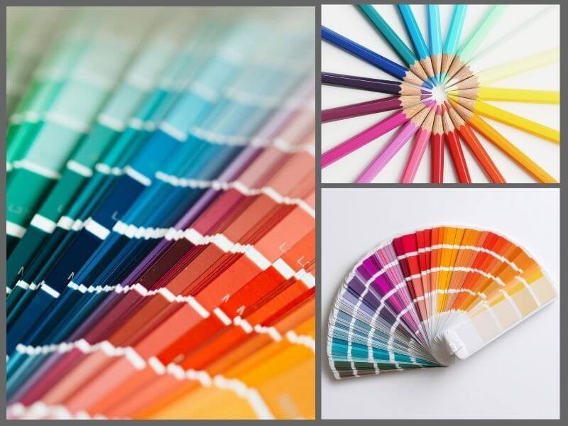
You’ve probably come across a design, website or similar and got the impression that everything looks “somehow messy.” It’s often due to a poor choice of colors. Either too many shades that don’t go together. Or a lack of contrast. Find out why colors matter and why there is such a thing as the “psychology of color.”
The psychology of color helps align the message you want to send with the feeling the color evokes. The goal should never be “as long as it looks nice,” but rather communication that is easy to “read” and quickly understood.
People don’t keep clicking through your website because they’ve analyzed every single word, but because they’ve felt something. Color is what does that job and sets the stage for the text that follows.
Visual impression works faster than text, so color doesn’t only affect the appearance but also the way a person interprets the content. One shade can spark curiosity, another can cause discomfort.
- Yellow – quickly grabs attention, associated with optimism, but requires moderate use
- Orange – gives energy, motivates activity and interaction
- Red – creates a sense of urgency, encourages quick decisions
- Pink – softens the message, creates a sense of closeness and support
- Purple – gives an impression of personality, quality, and reflection
- Blue – calms, instills trust, associated with expertise and stability
- Dark blue – emphasizes seriousness, responsibility, and security in business communication
- Green – suggests balance, nature, and approval
- Dark green – suggests sustainability, locality, and natural quality
- Beige – unobtrusive and warm, suitable for products aiming to convey calm and safety
- Grey – neutral and stable, works well as a background or accent for professional services
- Black – appears strong and serious, often used in luxury and formal contexts
Examples of common mistakes to avoid:
- Light background same as text: the message looks faded and is hard to read
- Clickable buttons (like 'buy' or 'send inquiry') in the same color as the header: the person doesn’t know where to click
- Highly saturated colors in large amounts: distract from important content
- Combinations that resemble competitors: the sense of brand identity is lost
- Using trendy shades without connection to the product: comes across as superficial
Emotion drives action, and color evokes that emotion
People do not click because they have examined every word, but because they felt something in the first moment. Color is what will “do” that job and prepare the ground for the text that follows.
Visual impression works faster than text, so color affects not only appearance but also the way a person interprets the content. Orange gives energy and encourages a decision. Purple leaves an impression of personal care and self-care.
Black feels powerful, especially in combinations that emphasize seriousness. Pink softens communication and makes it more approachable. Blue calms, but also instills a sense of security, which is important for products and services that require trust. Color can improve the clarity of a message and make it easier to accept because it creates a sense of familiarity, stability, or motivation, depending on what one aims to achieve.
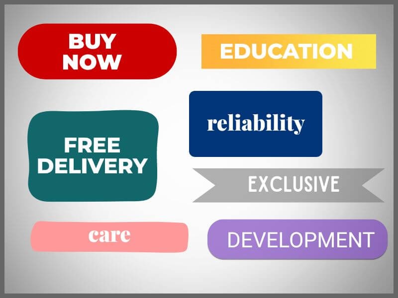
Examples that work well:
- Red “buy now” button during seasonal discounts
- Blue background for a text about service reliability
- Green bar for free delivery
- Dark grey for offers that carry a dose of exclusivity
- Pink in visuals that communicate care, support, and warmth
- Purple details in campaigns for products related to body care or personal development
- Orange button for signing up for education that encourages activity
- Combination of dark blue and white for services that need to appear stable and serious

Shade and contrast determine how much something gets read
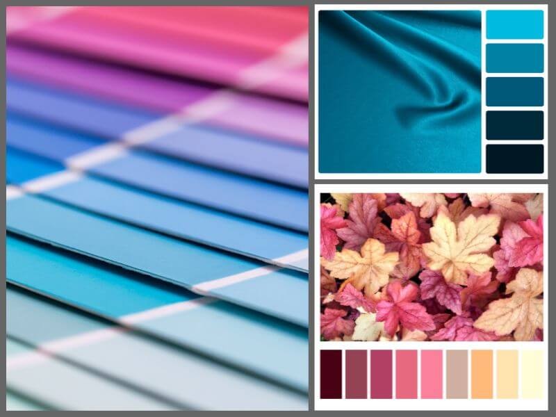
One color can have multiple meanings, depending on tone and context. Dark green is not the same as neon green. Pastel pink is not the same as fuchsia. A warmer shade of yellow can feel inviting, while a cooler yellow can feel stiff.
If the action button is the same color as the background, it is there, but it is not visible. If all the colors are similar, the message gets lost.
In digital marketing, visibility is a prerequisite for effectiveness because content must be readable immediately, without effort. Contrast helps highlight what is important, while shade defines the feeling that will accompany each piece of information.
Examples of combinations that create a clear hierarchy:
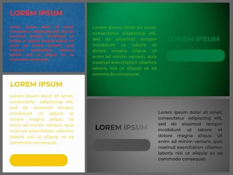
- White background, dark blue headings, orange buttons
A classic and reliable combination. White opens up the space and allows all information to stand out. Dark blue headings give a serious tone, while orange buttons clearly point to the next step, such as signing up or buying.
- Light grey background, black text, yellow labels for promotions
A neutral and tidy base with high readability. Black text is easy to read without strain. Yellow labels immediately draw attention to special offers, discounts, or limited information without interfering with the rest of the content.
- Beige background, brown headings, olive green labels for discounts
A warm, earthy palette often used for promoting handmade products, eco offers, or wellness services. Everything feels natural, while green labels subtly indicate benefits.
- Dark blue background, white text, light yellow highlights that guide the eye
Useful for presentations, educational platforms, or offers that require focus. White text is easy to read and feels serious, while light yellow highlights (e.g. arrows, dots, underlined sections) direct attention without distraction.
- Light blue background, dark grey text, pink elements for a softer touch
Suitable for communicating services related to health, family, or personal development. Everything looks calming, and pink details (icons, buttons, labels) add a sense of closeness and care.
- Light beige background, burgundy headings, dark green details for a natural impression
This combination feels serious yet approachable. Burgundy is used to emphasize key information, while dark green brings a sense of reliability and stability.
- Black background, white text, gold accents
Most often used by brands that want to emphasize exclusivity. White text on a black background creates strong contrast, while gold details convey value and control.
- Mint green background, dark blue text, pale pink buttons
A fresh, modern look often used in the beauty and lifestyle industry. Mint green relaxes, dark blue text remains serious, and pink buttons invite action without being intrusive.
Consistent use of color creates recognizability
If a different palette is used in every ad, the person who sees the ad does not know who is addressing them.
If the website and social media do not visually match, the brand looks like it has no identity. Disconnection creates doubt and makes it harder to build trust.
The psychology of color helps align all parts of communication so that posts, ads, and pages speak the same visual language. Color, when used consistently, becomes an association – something we recognize before the logo or name. Maintaining a recognizable look means reinforcing your visual signature.
Tips for consistency:
- Choose three main colors: a primary one (dominates in communication), a supporting one (provides balance), and an accent color (used for buttons, labels, and highlighted elements)
- Use the same colors across all formats and channels: ads, website, email, business cards, packaging, presentations
- Keep a record of all selected colors: use HEX (color display on the web), RGB (for digital screens), and CMYK codes (for print) to apply the colors correctly in digital and printed materials.
- Align colors with fonts and photos: entire communication has the same tone and impression
- Create brandbook with color guidelines: share it with everyone working on visuals (designers, developers, copywriters)
Color must match the product, service, and audience
A good color choice is not universal. There is no palette that suits everyone because each industry carries a different tone, rhythm, and set of expectations.
Colors are chosen based on what is being offered, to whom it is offered, and what message needs to be conveyed. If someone is selling educational programs for parents, they do not use the same palette as a company offering business consulting services.
If promoting natural cosmetics, colors must feel clean and gentle. Companies that offer highly professional services must appear stable and serious, while brands that communicate emotion or entertainment should appear open and lively. Color needs to match the audience's expectations, not personal taste.
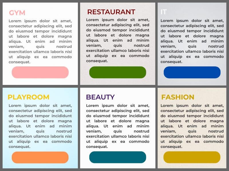
Examples by industry:
- Women's gym: pink, dark grey, and white – a combination that feels strong but unobtrusive
- Local restaurant with traditional cuisine: dark red, beige, and olive – creates a sense of warmth and tradition
- IT company selling software to businesses: dark blue, white, and light grey – a combination that communicates reliability and order
- Children’s playroom: yellow, light blue, and orange – a palette that encourages joy and a sense of safety
- Cosmetic brand focused on natural ingredients: lavender, olive green, and white – feels clean, gentle, and natural
- Adult education studio: grey, blue, and red – emphasizes the seriousness of content with visual dynamism
- Online store with fashion accessories: cream, black, and gold – simple, elegant, and easy to navigate
- Physical therapy clinic: pastel green, light grey, and white – a combination that calms and creates a sense of professionalism
Poor color choices can reduce sales and trust
If people say “I don’t like the design,” they are often actually confused by the colors.
Too many colors without clear purpose look disorganized. Too few colors seem bland. Excessive contrast can appear aggressive. A poorly chosen palette makes navigation harder, distracts attention, and weakens the impression of professionalism. When everything adds up, the person feels that something is off, even if they cannot say exactly what.
The result? Less trust, fewer clicks, fewer sales. And not because of the content, but because of the impression created by the colors in the background.
What to avoid:
- Red text on a blue background – hard to read, causes visual fatigue
- Light yellow letters on a white background – nearly invisible on most screens
- Combinations of multiple bright colors without a clear hierarchy – look chaotic, it is unclear what matters
- Color inconsistency between online and offline communication – creates an impression of inconsistency and lack of professionalism
- Dark background with dark text – requires effort to read and repels the viewer
- Too many similar tones – information blends together, everything looks the same
- Colors that do not fit the brand’s context – for example, bright fluorescent shades in communication from a law firm
- Inadequate colors for buttons or calls to action – if a button looks the same as the background, the person will not notice it
The psychology of color helps achieve more effective marketing
Colors do not sell anything by themselves. But they help convey emotion, hold attention, and trigger action.
Color can be used to highlight what matters, soften a message that might otherwise sound too aggressive, or bring structure to content that is information-heavy. The goal is not to beautify the design.
The goal is to make it meaningful, consistent, and easier to read and interpret. Color will not do the job for you, but it gives you an edge – especially when you have only a few seconds to make an impression.
Companies that know what they want to say can turn color into a quiet signature of their communication. You do not need to use many colors. It is enough to use them consistently, at the right moment, and with clear intent. The psychology of color is a tool for any company that wants to appear serious, clear, and convincing – whether it is a restaurant, clinic, or software provider.
What to do if colors are not doing their job:
- Check whether the same palette is used across all channels (web, ads, social media)
- Review which colors are used for calls to action and whether they can be made more prominent
- Avoid shades that look different on various screens (for example, too light or grainy)
- Connect colors with the theme of the product or service, not with personal taste
- Create simple visual guidelines that anyone working on content can follow
If your posts or ads go unnoticed, the issue might not lie in the text or the audience. The problem may be in how everything looks together. And color is often the first thing to change.
At Zona plus, we regularly help small and medium-sized businesses refresh or fix their visual communication – without losing their identity. Contact us if you would like to check how colors affect your marketing and what can be improved immediately.