

You have a website but receive no inquiries? People browse but do not reach out? A website can be technically correct and have excellent content, yet still fail to deliver results. In most cases the problem is not in the appearance, but in how easy the website is to navigate.
It is not enough to simply have a website, what matters is what happens when someone opens it.
And when someone opens it, much more happens than just looking at images, reading text, clicking links or making a purchase, reservation or something similar.
Every second spent on the website leaves an impression on that visitor. That impression is called user experience.
User experience is not only design, appearance or colours on your website, but much more than that. What matters is functionality, clarity of information and the overall impression someone gets after visiting your website.
If everything is clear and fast, people stay longer, click more often and are more likely to contact you, buy, order or book something. If not, they will simply close your website and go somewhere else to find what they need.
Just one small moment is enough to determine whether your website will work for you or against you.

User experience (UX, "user experience") refers to the overall experience a visitor has while using a website.
This does not include only what is seen on the screen, but also what happens in the background; how the website behaves, whether it is easy to browse, how easy it is to complete the task someone came for in the first place.
A few questions that can help you assess user experience:
It is actually about a sense of orientation. If a person does not need to put in too much effort to find what they are looking for, if it is clear what and where to click and if everything works properly, the chances are higher that they will stay on the website, read more, send an inquiry or take an additional step. If this is not the case, even the most beautiful images and colours will not help you, because it is not enough to simply have a website.
Many people think about appearance first when creating a website. And that is fine, a website should look good and be aligned with your brand, logo, colours and so on.
But none of that should ever be more important than how the website works.
A website may look excellent at first glance, yet still be slow or confusing for someone trying to use it for what they actually need.
Imagine these situations:
In these situations, the visitor does not need to know (and does not want to know) what exactly is wrong, but they will definitely give up.
If you have a website, you may not even be aware of how much just one small detail can influence whether someone will close the page or not. Details that may seem unimportant to you or that you do not even notice as mistakes can be very confusing for someone else.
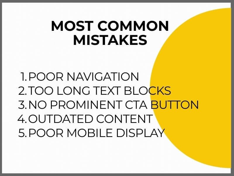
These are the most common problems on websites:
1. Poor navigation
If the menu is overcrowded and seems endless, visitors do not know where to click and quickly lose patience. Navigation should have a clear structure and logical order, without repetition and unnecessary items.
2. Text blocks that are too long
If the content is written without paragraphs and subheadings, it is difficult to navigate. People scan text, they do not read from beginning to end. It is important to break up the content visually and show what is important right away.
3. No prominent CTA button
If there is no clear call to action, the visitor does not know what to do next. Even when they are interested, if there is no contact button, they will not know how to reach you. Each page must have a clear and visible button that leads to the next step.
4. Outdated content
If the homepage says “special offer until March 31” and it is currently November of the same year, you are sending the wrong message. This may seem like a small thing to you, but it actually shows that no one is taking care of your website and that you do not care. It may even give the impression that your business is no longer active.
5. Poor mobile display
More than 60 percent of online traffic comes from mobile devices. If elements and or images overlap on the mobile version of your website, or the text needs to be moved horizontally or zoomed in to be readable, this is not a good experience for the end user, is it.
In most cases these problems are not the result of bad intentions, but of the fact that website owners often view the website from their own perspective and not from the perspective of the visitor, that is, the future buyer or client.
It is recommended to ask someone else to review your website, someone who will give you the best information about what is wrong and what should be improved.

Some problems on a website are not difficult to notice, if the page loads slowly or an image does not display, this is immediately visible.
Many problems in user experience are discovered only when you look at visitor behaviour and ask yourself why the website is not achieving the desired results.
Here are a few questions that can help you with that:
If you recognized yourself in any of these situations, there is a high probability that your page is not working the way you think.
This does not mean you need to change everything or create a new website. It is enough to make a few changes that guide the visitor better, highlight what is important and remove obstacles that may have slipped past you.

If you want to know exactly where your website gets stuck and makes navigation difficult, it is enough to perform a few basic checks.
You do not need to dig through settings, the goal is to review the page as someone who is seeing it for the first time.
Start like this:
1. Check the loading speed of your page.
It would be optimal for the website to load in under 2 seconds. Between 2 and 3 seconds is acceptable, although 40 percent of people give up waiting. Tools such as PageSpeed Insights or GTmetrix will show you the loading speed and exactly where the problems are and why the page loads more slowly.
2. Open the page on a mobile phone and tablet.
Review your website as if you were visiting it for the first time. Is everything clear? Do you need to zoom anything? Is it easy to find information? Is it difficult to find your way around the page?
3. Ask someone to review your page.
Give them a task, for example, find the prices or send an inquiry through the contact form and observe how long it takes them. Let them tell you what works well and what does not.
4. Look at every subpage and check whether there is a clear call to action.
For example: “Send inquiry”, “Request an offer”, “Call us”. No page or subpage should end without clear instructions for what to do next.
5. Review all content.
Are there outdated details, incorrect dates or invalid information? Accurate and up to date information shows that someone regularly maintains the page, which builds trust.
The point of all this is to remove the obstacles you do not see, because you look at the page from your own perspective. Visitors do not have the same context, they need a clear, fast and simple solution.
CTA (short for “call to action”) is the name for a button and link that gives the visitor clear instructions on what they can do next.
It is a basic element because it essentially determines whether someone will stay on your website and take the next step or simply leave.
If the page has no CTA, or if it is not clearly visible, the visitor has to figure things out on their own. And most of them will not bother searching too much.
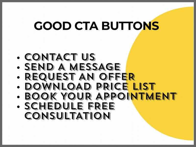
Good CTA buttons are clear, short and focused on a specific action, easy to notice and immediately show where they lead.
Examples:
CTA should be noticeable enough but not intrusive. It is especially important to adjust them for mobile display, they should be large enough but not overlap with other content and should be easy to click.
One page can have several CTA elements, but each should have its own purpose. It is not a problem if the same call appears several times because it is important that the visitor does not miss it.
In user experience what matters is what visitors to your website expect and how easily they can reach the information they came for.
People have become accustomed to clear and fast websites without unnecessary obstacles. No one has the patience (or time) anymore for filling out complicated forms, reading endless text or navigating confusing layouts.
Here is where poor user experience becomes visible within the first few seconds:
These things create resistance in people. Not because they do not know how to fill out a form or read a text, but because they do not want to fill out that form or read that text, in other words, they do not want to waste time.
If your website is important for sales, scheduling appointments, inquiries or any form of business contact, it makes sense to invest in improving it. Especially if there is traffic but no concrete inquiries.
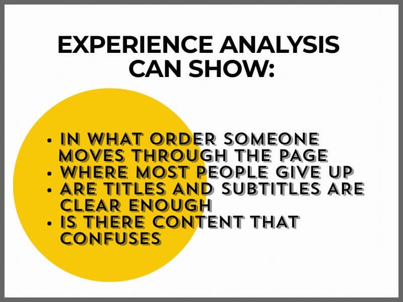
A professional user experience analysis can show exactly where and why visitors lose interest. A person who works with user experience, that is, UX, looks at the page through the eyes of the visitor and, among other things, checks:
Investing in UX does not mean completely changing the page. In many cases it is enough to rearrange a few elements, organise the content better or change some steps.
Your website is the place where the first contact happens with people interested in your offer. If something on it does not work the way it should, the result is a lower number of inquiries.
If you feel that your website is not delivering what it should, user experience is the first thing worth checking.
Do you want a website that works in your favour? Contact us, we will take a look together.